
2027 Color Trends: How to Bring Color Into Your Home Without Starting Over
Every year, I look forward to the Color of the Year announcements. As an designer, in the Texas Hill Country, I love seeing where color is headed, what inspires the new palettes and how those choices begin to influence interiors.
But there's something important to remember:
There isn't just one Color of the Year.
Paint and design brands each select their own Color of the Year, and together, those choices can give us a fascinating look at the larger direction of interior design.
And 2027 is already telling us something interesting.
Color is coming back with personality.
We're seeing soft blues, earthy greens, terracotta, warm rose and nature-inspired shades. Many of these colors are still comfortable and livable, but they're moving beyond the traditional whites, grays and beiges we've seen dominate interiors for years.
The 2027 Colors of the Year So Far
As of September 2026, six major brands have announced their 2027 Colors of the Year, with more announcements still to come.
Sherwin-Williams: Celery SW 6421
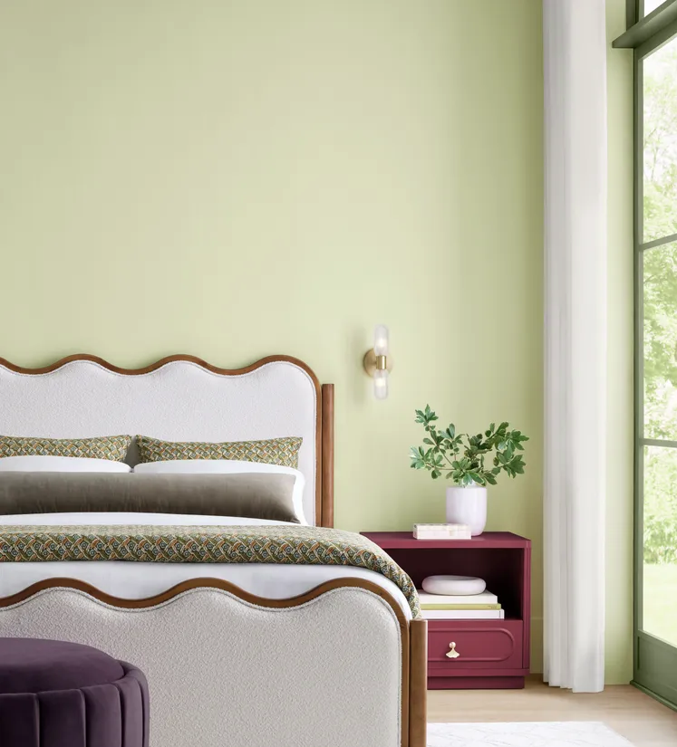
Image Credit: Sherwin Williams
Sherwin-Williams selected Celery SW 6421, a soft yellow-green, as its 2027 Color of the Year.
Celery comes from the brand's broader Rewild forecast, which explores nature-inspired greens, warm neutrals, blues, reds, purples and deeper earthy tones.
What I find especially interesting about this palette is the balance. Celery itself is relatively light and fresh, while the surrounding palette includes much deeper colors that can add contrast and depth.
Sherwin-Williams describes the color direction as connected to wellness, balance and a desire to bring elements of nature into the home.
How I might use it:
Celery could be beautiful on walls in the right space, but it could also be introduced through artwork, textiles, a painted piece of furniture or accessories.
Behr: Grounded T27-01
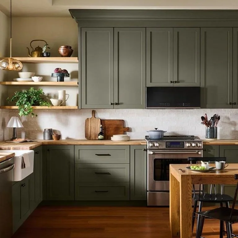
Image Credit: Behr
Behr's 2027 Color of the Year is Grounded, a mossy olive with brown undertones.
This is a deeper, more saturated color than Celery and has a wonderful earthy quality.
Grounded is a great example of the shift toward greens that feel less like a traditional pastel or sage and more connected to soil, foliage and natural materials.
How I might use it:
Think cabinetry, an accent wall, a study, a dining room or smaller doses through upholstery and accessories.
Glidden: Artifact PPG10-16
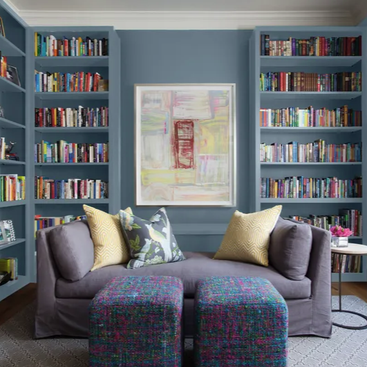
Image Credit - Glidden
Glidden selected Artifact, a warm smoky blue.
Blue continues to show up in the 2027 conversation, but we're seeing it in softer, more complex versions rather than relying solely on traditional navy or pale blue.
Artifact is a good example of how color can function almost like a neutral while still giving a room personality.
How I might use it:
This would be beautiful on cabinetry, walls, built-ins or in a bedroom or office where you want color without overwhelming the space.
Valspar: Cottage Door 8004-38E
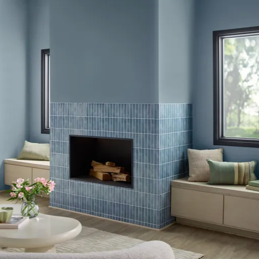
Image Credit: Valspar
Valspar selected Cottage Door, a mid-tone blue that the brand describes as a colorful new neutral.
This is one of the colors that really demonstrates how our definition of "neutral" is changing.
Neutral doesn't necessarily have to mean beige, white or gray.
A softened blue can provide the same versatility while bringing much more personality into a space.
How I might use it:
Try it on walls, cabinetry, a ceiling or even as an accent color paired with warm neutrals and natural materials.
Dutch Boy: Deep Rooted 311-7DB
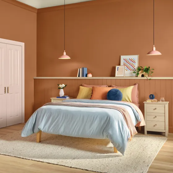
Image Credit: Dutch Boy
Dutch Boy went in a warmer direction with Deep Rooted, an earthy orange with terracotta character.
This is probably one of the more unexpected colors in the 2027 group, but I think that's what makes it interesting.
It's not the bright orange of a children's playroom or the heavily themed Tuscan orange we may remember from years past. It is warmer, grounded and much more connected to natural clay and earth tones.
How I might use it:
This could be beautiful as an accent color in a living room, dining room or bedroom, especially paired with creamy neutrals, natural wood, muted blues and greens.
Graham & Brown: Rose Earth
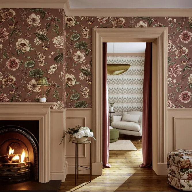
Image Credit: Graham & Brown
Graham & Brown selected Rose Earth, a warm, earthy rose with clay and muted brown undertones.
I love that this color brings a little warmth and softness into the 2027 conversation without feeling overly pink.
It's another example of color becoming more nuanced. Instead of bright, obvious color, we're seeing shades that have enough complexity to work beautifully alongside natural materials and timeless furnishings.
How I might use it:
Think bedrooms, dining rooms, powder rooms, built-ins or even a smaller accent area where you want warmth and personality.
What Do All These Colors Have in Common?
At first glance, these colors may not seem to have much in common. Green, blue, orange and rose may feel like very different directions, but look a little closer and a pattern starts to emerge: nature, comfort, warmth, connection and, perhaps most importantly, personality.
Several of the 2027 selections are colorful without being overwhelming. They're softened, earthy or complex enough to live with.
That tells me that we're not necessarily moving away from comfort.
We're simply finding more colorful ways to create it.
Your Home Isn't a Trend
This is the part I care about most.
A Color of the Year is inspiration. It isn't a command.
Your home isn't a trend. It's an evolving environment, and a reflection of you.
If you love your sofa, keep it.
If your kitchen cabinets still work beautifully for your family, you don't need to replace them because a new green became popular.
If you have artwork that you've loved for years, don't get rid of it just because the color palette has changed.
Instead, look for opportunities to layer something new into what you already have.
How to Bring 2027 Color Trends Into Your Home
Start With Pillows
Pillows are one of the easiest ways to experiment with a new color.
Try introducing a muted green, earthy orange, soft blue or warm rose into an otherwise neutral room.
You can change them later without making a major investment.
Add Artwork
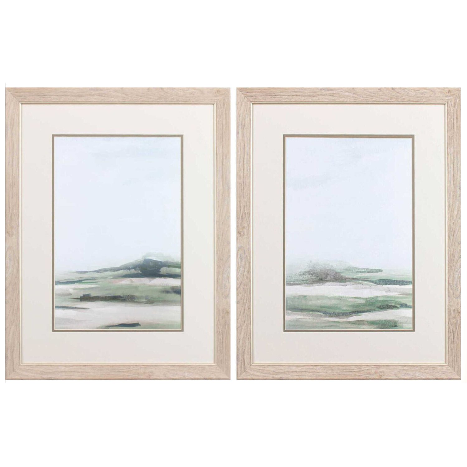
Artwork can introduce several colors at once and give you a starting point for a new palette.
Instead of matching the artwork perfectly to your room, look for one or two colors that you can pull into your existing furnishings.
Try a Lamp or Accent Piece
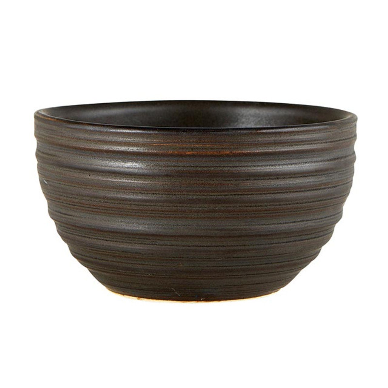
A lamp, vase, bowl, sculpture, or other decorative object can introduce a trend color in a small but noticeable way.
This is especially helpful if you're curious about a color but aren't ready to make a big commitment.
Live with it.
See how it feels in your space.
You may discover that you love it.
Or you may discover that you don't.
Either way, you've learned something about your own style without making a major investment.
Paint Something Small
If you're ready to commit a little more, consider painting a piece of furniture.
A side table, cabinet, vanity or even an interior door can become an opportunity to try a new color.
And if you love it?
You may decide you're ready to take the color somewhere else.
Keep the Big Pieces Timeless
My general recommendation is to be more thoughtful with your larger purchases.
Sofas, dining tables, cabinetry and major upholstered pieces are investments you'll likely live with for many years, so I prefer choosing quality, timeless pieces and allowing the smaller details of a room to evolve.
That way, you can enjoy what's happening in design without feeling like your home needs a complete makeover every few years.
Shop Your Own Home First
Before you buy something new, take a look around your house.
You may already have the perfect piece.
Move artwork from one room to another.
Try a different throw.
Bring a vase out of storage.
Rearrange your accessories.
Sometimes the best design update doesn't involve shopping at all.
It involves seeing what you already own with fresh eyes.
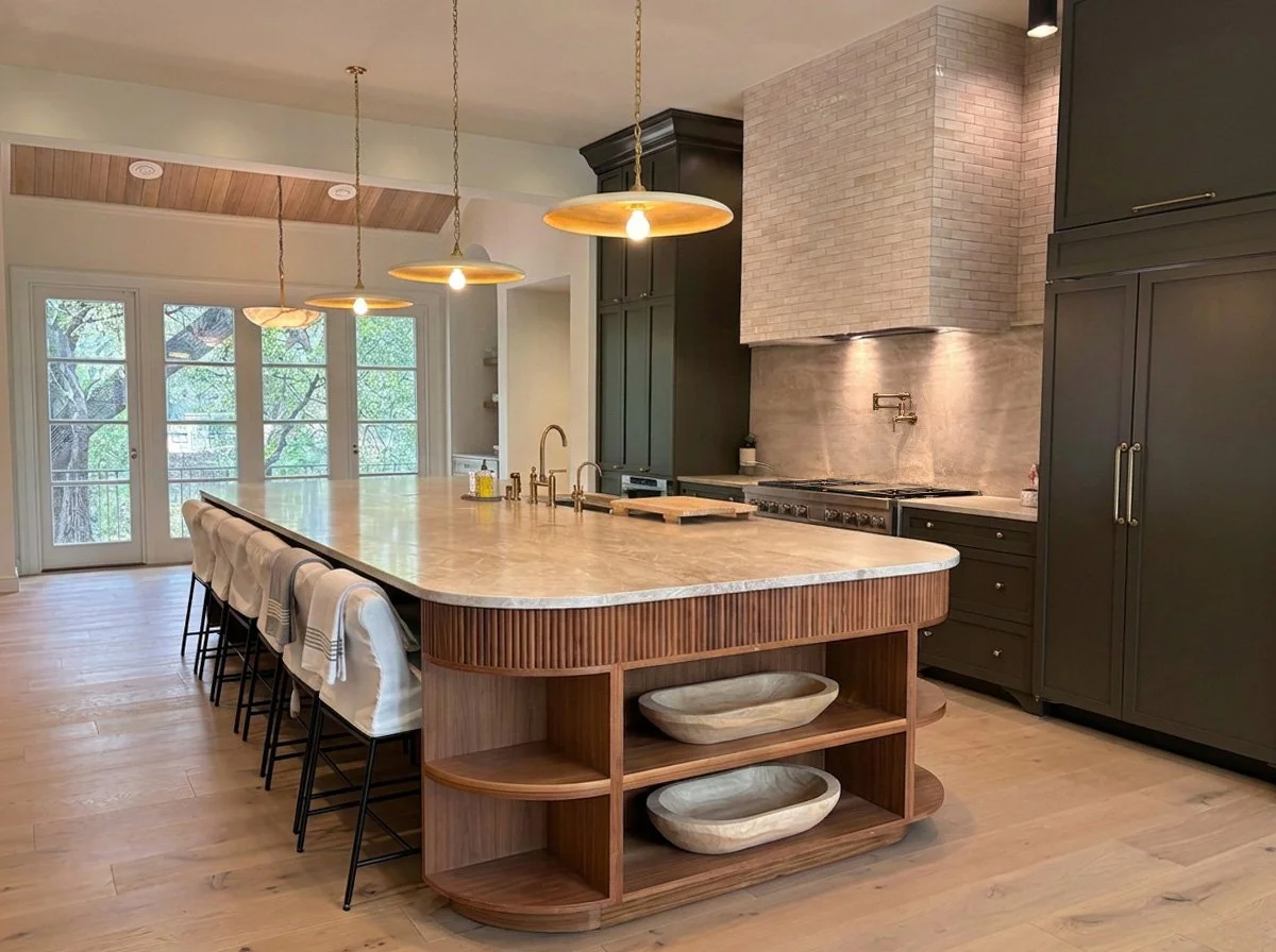
A stunning example of a timeless kitchen color palette designed by Soaring Phoenix Creative.
The Best Color Trend Is the One That Feels Like You
You don't have to love Celery.
You don't have to paint your walls olive green.
And you don't have to bring terracotta into your home just because Dutch Boy says it's having a moment.
Instead, use these colors as inspiration.
Maybe you're drawn to the softness of Celery.
Maybe Cottage Door makes you realize you love blue.
Maybe Grounded is exactly the earthy green you've been looking for.
Or maybe you look at all six colors and realize that your current palette is still perfect.
That's okay too.
Good design isn't about following every trend.
It's about understanding what's happening in design and knowing how to interpret it for your own home.
And There Are More Colors Coming
The 2027 Color of the Year conversation isn't finished yet.
Benjamin Moore currently lists its 2027 Color of the Year announcement for October, so there are more colors to come.
And I'll be watching.
Because color is one of my favorite ways to see how design evolves from year to year.
Want Help Finding the Right Colors for Your Home?
If you're ready for a refresh but aren't sure where to begin, I'd love to help.
At Soaring Phoenix Creative, I look at the whole picture: your home, your existing furnishings, your lifestyle, your personal style and how you want your space to feel.
Sometimes the answer is a renovation.
Sometimes it's a new color palette.
And sometimes it's simply a few intentional changes that make your home feel fresh again.
Your home doesn't have to follow the trends.
It just has to feel right for you.
Design that rises above.
You don't have to redecorate to add a little color either.